NewIntroducing Memo AI — Turn voice notes into structured insights→
NotePlan 3.9.4/5 has arrived and it comes with new and better formatting options and styles. The new options help you structure notes, text, and tasks in a more visual way.
Plus, it’s now possible to customize your theme even further. So your notes look just the way you want. From type and styles to (background) colors and more!
Give the latest version a spin and start customizing!
More clarity and focus with formatting options
Plain text is great but notes with basic formatting get boring after a while. And it’s harder to find the information you need without visual clues (type, color, etc.). The latest version of NotePlan gives you new options to make your notes stand out.
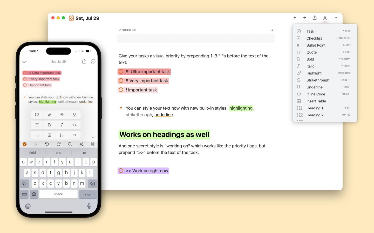
The latest version introduces the following new markdown styles with their corresponding markup:
- ~~strikethrough~~ to cross out words, useful for when you want to mark something as done or deleted
- ==highlighting== make things stand out, like keywords or central concepts
- ~underlining~ use it to create a light emphasis
- use exclamation marks to give tasks a priority: !!! your very urgent task, !! an urgent task, ! an important task
- keep the task you’re currently working on front and center with special formatting >> your next task
You can use the new formatting options on words, headings, and even paragraphs by wrapping them with the markup above.
They’re also available under the Format Menu or the “A” menu top right of your note (macOS). On iOS and iPadOS, you’ll find the styles in the toolbar under the “A” icon.
Finally, the public pages also display the new formatting.
Flexible theme styles for customized notes
NotePlan’s new formatting options are great but what if you want yellow highlights instead of green? Or maybe that underline would look better in blue? In NotePlan 3.9.4 you can tweak the look and feel of your notes even further by extending your theme!
The latest update lets you change all formatting styles by giving you control over:
- Line spacing
- Paragraph spacing
- Font color
- Background colors
- Underline colors
- Strikethrough colors NEW
- Leading borders (like the blue quote line) NEW
- Padding of highlights NEW
- Border radius for the background of highlights NEW
With the new styling controls, you can give NotePlan a facelift to customize the look and feel. Change the color of task checkboxes, add padding and border-radius to a specific tag, or create full-width background colors for your headings.
For example, you can make the #someday tag a gray color with rounded colors and black text. Or maybe you think the >> working on is a shade too purple? Just change it to a color you like.
📖 You can read all about creating your own themes and styles in the docs.
🍿 Watch how Stacey has customized NotePlan's look and feel.
And did you know NotePlan comes with built-in themes? There are more than 20 available right inside NotePlan, including popular coding themes like Dracula and Monokai. So there’s no need to start from scratch. Just select an existing theme and use it. Or copy it and start modifying it to your liking.
✨ More new features
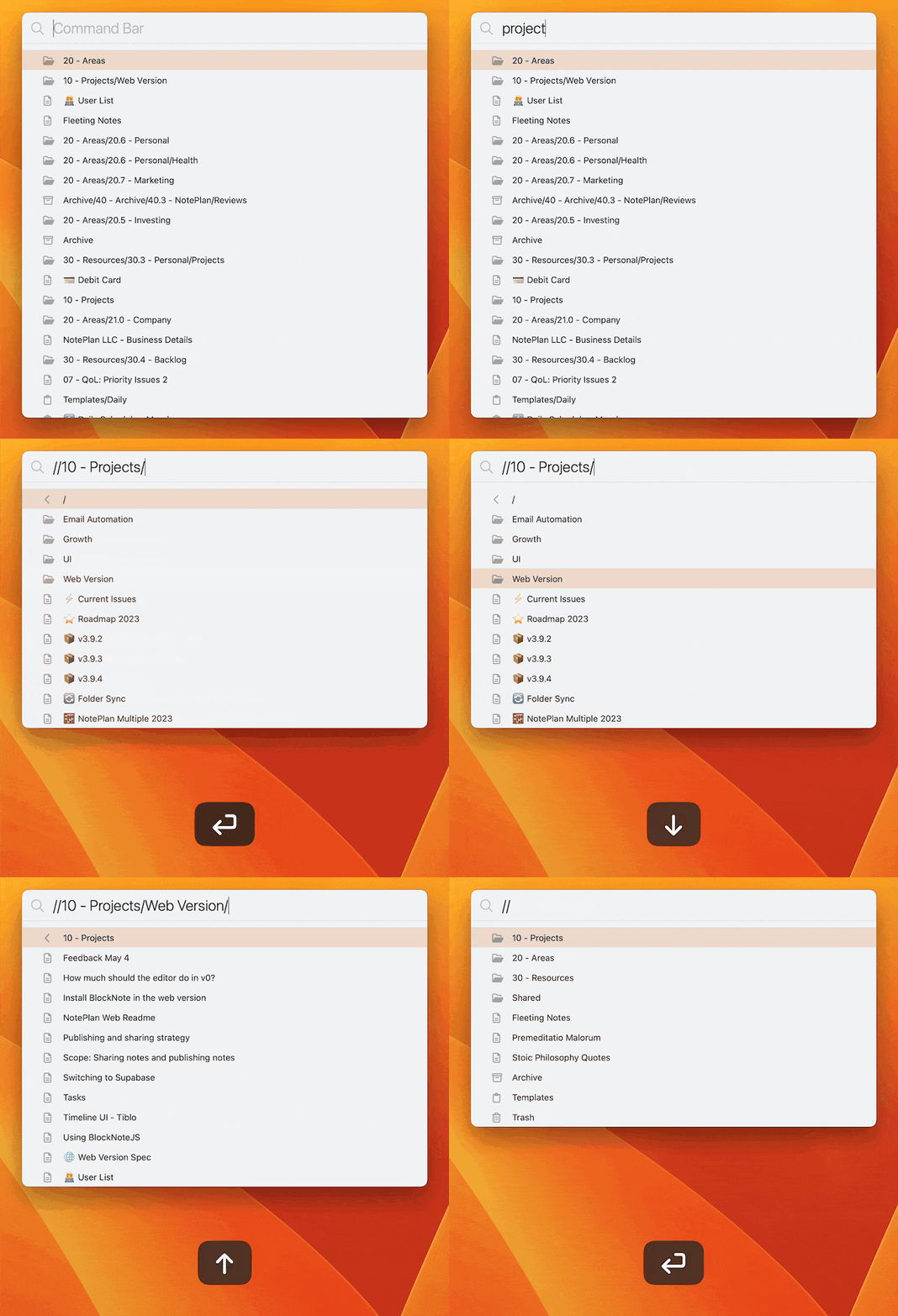
- Folders: You can now search for Folders with the Command Bar (Cmd+J) and link to folders just like you can link to notes: [[Folder Name]]
- New AI Prompts: OKRs (creates OKRs from your goals), Clear Writing (rewrites the text to make it clearer), and Summary (as the name says, summarizes)
- Theme Picker: The theme picker in NotePlan now shows more themes side by side and previews without Markdown formatting

💎 What Else is Improved?
- On iOS, the Search/Command Bar makes a return to the toolbar by very popular request. The Heading icon is now under the A formatting menu, where only list styles were previously available.
- The command bar now has an updated list of actions for formatting, inserting images and files
- The command bar now shows icons for different types of notes: regular, archived, and templates.
- Better performance, especially for very long lines of text
- Better performance for very long notes
- Speaking of performance improvements: the formatting menu (under the A in your daily notes on macOS) now loads very quickly
- The Preferences received a small design update (rounded corners)
- Fixed an issue with time blocks in indented tasks
- Fixed a bug with setting a dark icon: an alternative icon is available now
- Fixed an issue with importing Obsidian notes with frontmatter has been fixed
---
If you are happy with the app, please rate it, or even leave a review. This is a great way to support us, indie developers. Thanks a lot!
Can one app really replace your entire productivity stack?
NotePlan did. Try NotePlan free for 7 days to learn how

